ShopDreamUp AI ArtDreamUp
Deviation Actions


Suggested Deviants


Suggested Collections


You Might Like…


Featured in Groups


Description
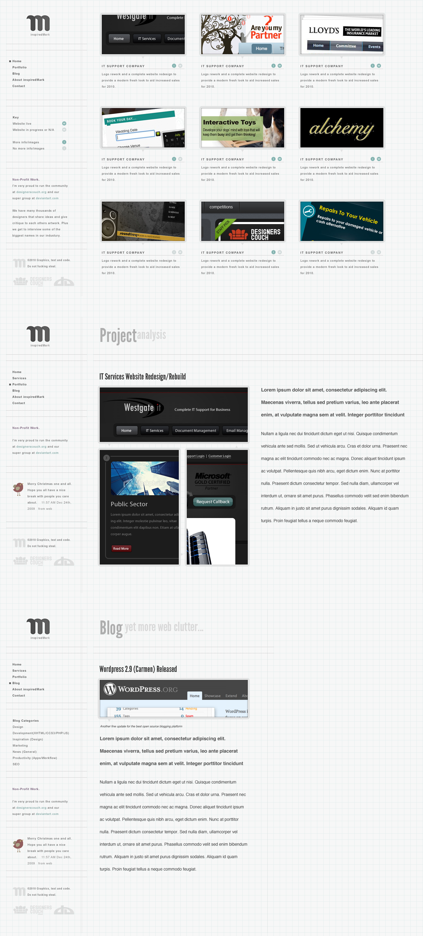
Played around with a new layout of my folio over Xmas. I just had 'keep it simple, stupid' in my head.
I've never done a fluid website before so thought I would play with the idea. I've alway done fixed width in the dead center. The left column will be fixed width to the far left of the window and the right hand main column will fill the browser window as I wanted the folio images to fill the screen.
Thanks for viewing.
EDIT: Started coding this in Firefox (will need tweaking for others): [link]
Image size
1429x3162px 964.83 KB
© 2010 - 2024 inspiredMark
Comments38
Join the community to add your comment. Already a deviant? Log In
Generally I really like this look. Feels very technical and precise, and so I dig it. I've got a few things to consider, as usual, which I hope help:
The grid background is cool but interacts oddly with the relatively small type. Perhaps put a white block surrounding the thumbnails+descriptions to help separate it from the background a bit to help with legibility. I'm not sure it'll look "right" but it's worth a shot.
Primary nav on the left isn't given any more attention than all other type. Enlarge the nav links or make them pop somehow to reinforce that people should look there.
At first glance I wasn't sure what the "I" and the "W" in circles represented. In fact I wasn't 100% sure it was an "I" at all. After a few minutes I now assume the "I" = info and the "W"=website. If that's the case, I think it might be good to spell those out. The tiny circular links didn't even register as being links anyway. They looked more like descriptors/tags to suggest this design has info and has a website.
I dislike the humanist stylings of the sans-serif you're using for "Project Analysis" and "Blog" as well as little headers. It doesn't match the implied precision of your layout (the graph paper, mostly). I'd pick a grotesque sans-serif that is very geometric (not corny-geometric, just classy geometric kinda like Futura except more contemporary). That way your font matches everything else you're trying to say with the layout.
I like the larger typography being used for secondary pages, but the leading is too loose. Leading is the space between lines of type, and while you do want a fair bit of it you certainly don't want it to be as loose as you've got it. The leading you have now makes it look like each line of type is separate, rather than being part of a larger cohesive chunk of text. My general rule of thumb with leading is to match the pt size of the text and then add at minimum 3pts. So for example, 10pt text on 13pt leading is comfortable. 10pt on 16pt leading is slightly too much.
Lastly, after looking at this for a much longer period of time, the grid effect has begun to bother my eyes. Maybe fade it back a tiny bit more? Overall a cool layout that's nice and simple (and has decent words per line, too!) but needs just a few tweaks to help button it up, in my opinion.
<img src="e.deviantart.net/emoticons/s/s…" width="15" height="15" alt="